


It’s 3 AM, and it’s morning at IIIT-Delhi. With around 30 students in the canteen, overwhelming number of orders were placed. My friend had to wait for another 30 minutes to get his, to regret that he wasted his time and could’ve done something that’d help him pass the mid-semester examination. But I was like it won’t matter much, hence ignored it.
The next semester was this course, Human-Computer Interaction taught by Dr. Grace Eden that led us ideate into issues that we faced in our daily life at IIIT-Delhi and work on them. Where it led us? Stay tuned :D
Introduction
The Team
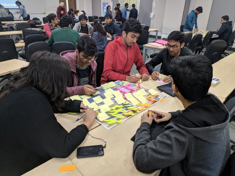
We had an amazing team where we had lots of fun, did some good work and applauded each other while criticizing to the max. extent! Members: [Aditya Sharma, Kunal Anand, Mukul Tomar, Rakshita Anand, Rishi Raj Jain]
The search
We arrived to her with these set of ideas on the theme ‘HCI and Time’:
1: Relying on google maps at the need of the hour, consumes user time and wastage of resources.
2: Inability of current psychiatric condition tracking devices to study the patient overtime & analyze the improvement in the conditions.
3: Procrastinating behavior and the inability of the user to make future decisions based on the growth, causing imbalance in one’s schedule.
[Find the detailed proposal]
While the second idea convinced us of it’s innovativeness, feasibility was a concern. With the aim to learn the process, the discussion with the professor concluded with that these ideas do require lot of input to work on with. But here’s the interesting the part, we got an idea from the professor herself, she faced the difficulty to walk down the nearly whole campus to reach canteen. She proposed ‘What about a food app for IIIT-D?’ and here are the set of things that got me all in for it, immediately!
Motivation and Inspiration
• Well, nobody wants to stand in long queues to order food, right? As a IIIT-Dian, say you’ve a deadline at 12 PM and you are very hungry as you could not go to mess for your dinner. What do you do now!?
• Life’s easier. Order and get back to work, pick up food on the way.
• What if I’ve had a friend bring my order? That’d be so cool!
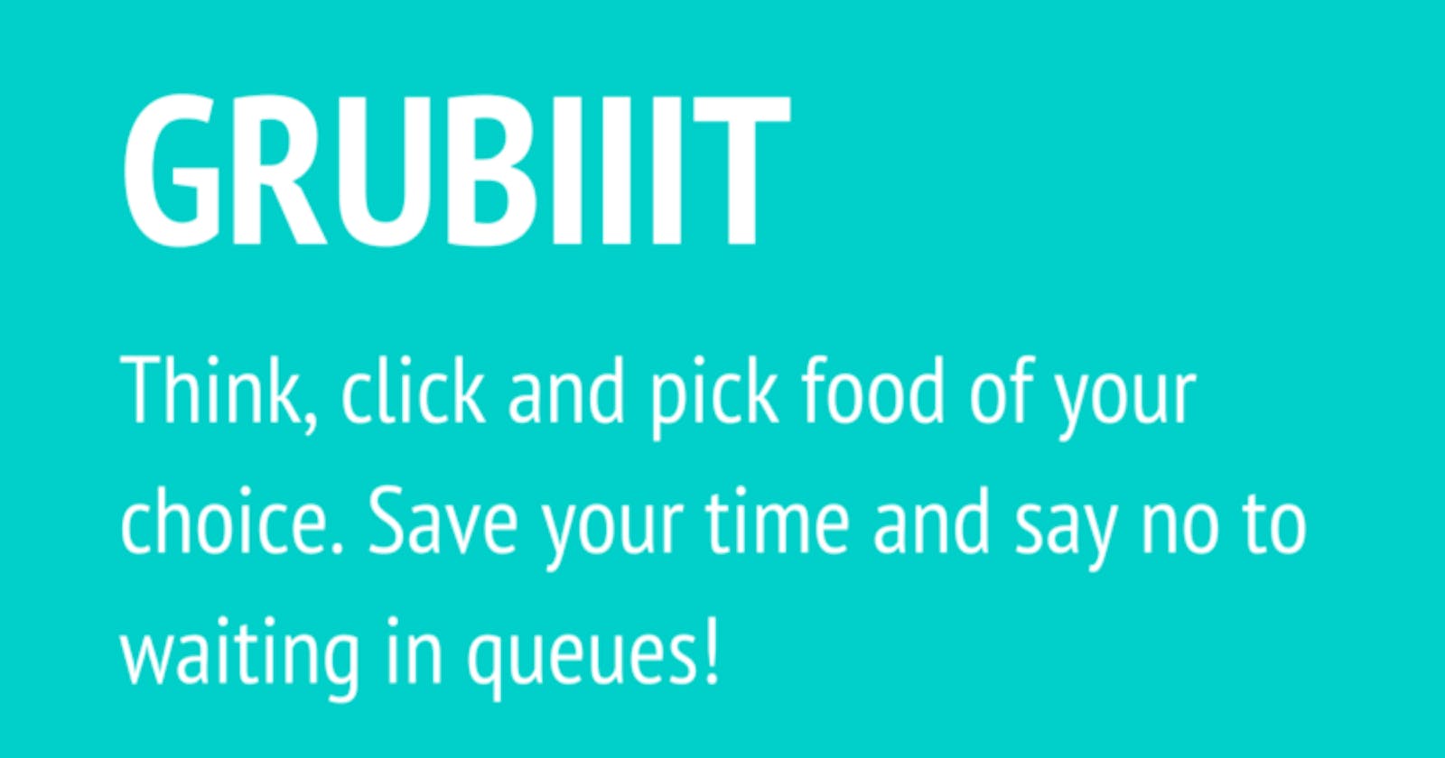
Problem Statement
“A customer trying to order food from food corners at IIIT-D, but the wastage of time caused due to standing in the long queues and waiting for the order to get prepared leaves him/her frustrated.”
We arrived at this problem statement after several iterations. Herein, we focused on Capturing the user and the need, after all problem statement identifies the gap between the current (problem) state and desired (goal) state of a process or product. [Wikipedia]
Competitive Analysis
“A competitive analysis is a way to collect and compare data about products(and companies) in the marketplace. This method is often used to highlight the strengths and the weaknesses of products in order to make more informed decisions about your product strategy.” — (Dalrymple, 2018)

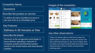
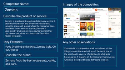
(Competitors: Zomato, Swiggy & Dominos)
Lookup our detailed Competitive Analysis at: https://drive.google.com/file/d/19j7wgYx1E5A7qfIIXDqxaepcb8Xa3F6r/view?usp=sharing
Summary
While Domino’s app definitely has a smoother ordering process than Swiggy and Zomato, they’ve lacked at addressing quick search. Swiggy and Zomato posed issues such as cluttered user-interface and non-removal of closed restaurants.
Though the competitive analysis lead us to the features meant to address some of the issues, it also limits our ability to think. This posed a need for conducting User Research as to gain insights from the user themselves.
User Research
User research is conducted so as to understand users’ characteristics, aims, and behaviors towards achieving these aims. Its purpose is to produce designs that improve their working practices and lives. [Ref.]
We proceeded with the Qualitative Research where we develop a deep understanding of why users behave the way they do. We conducted both, semi-structured and contextual interviews to gather such understanding.
Interview Process
We conducted 3 semi-structured and 2 contextual interviews, from B.Tech to Ph.D we tried to have at least one interview to bring diversity to the set within the time and course limitations.
Relevant User Quotes
“People who ordered for the same item after them, if reached to the counter before, get to receive it, as there is no proper mechanism for delivering the order as the workers there shout and call the order that is to be served.”
“The quality of food that I order from outside the campus is better than at food corners at IIIT-Delhi, and yes the food comes directly to the hostel.”
Summary
Me, specially was motivated after conducting interviews as it confirmed us of our suspicion! What else did I need? The problem we were looking for exists :D Talking to variety of people helped me understand what are their frustrations, needs, goals and expectations from the system.
Affinity Mapping
“The Affinity Diagram is a method which can help you gather large amounts of data and organize them into groups or themes based on their relationships. The affinity process is great for grouping data gathered during research or ideas generated during Brainstorms.” — Interaction Design
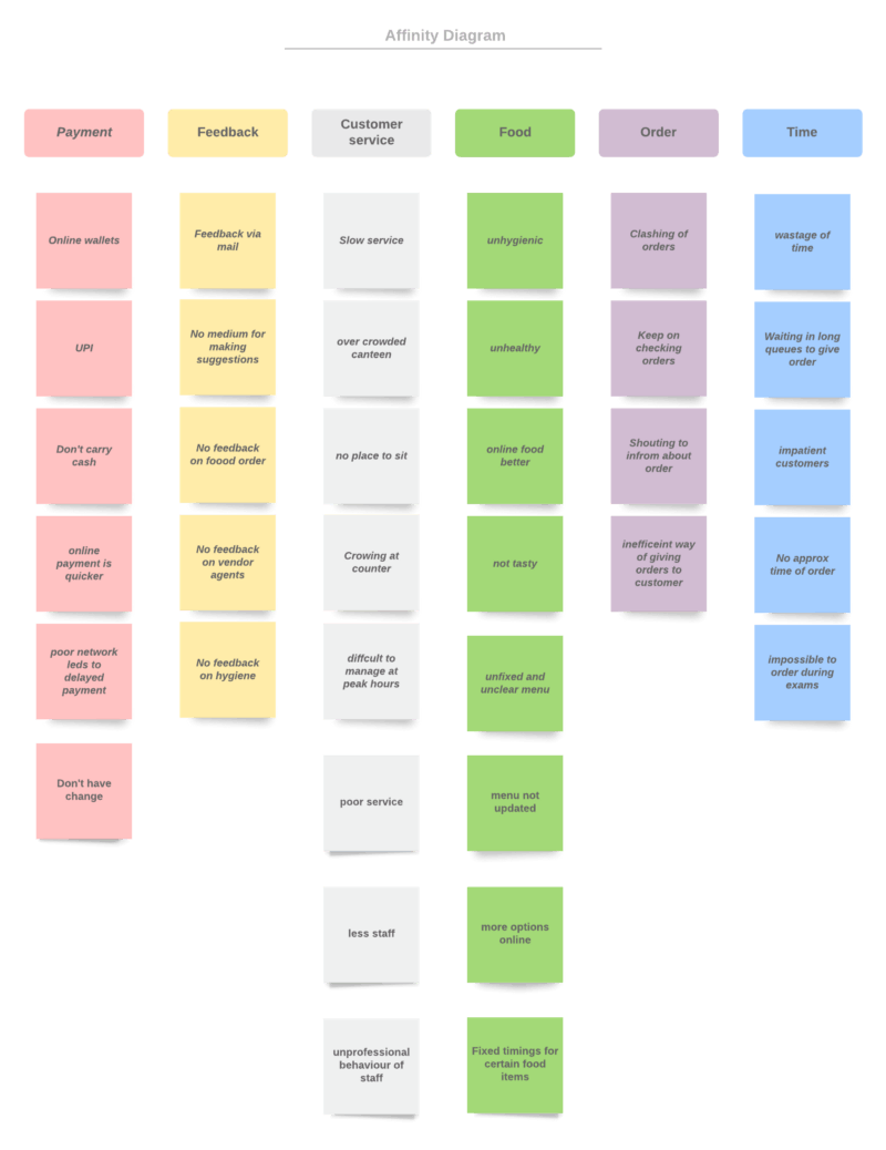
This is our final affinity mapping. We conducted three iterations as to be precise and cover every aspect that seemed feasible within the limitations.
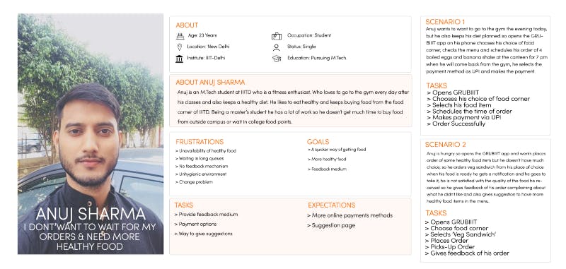
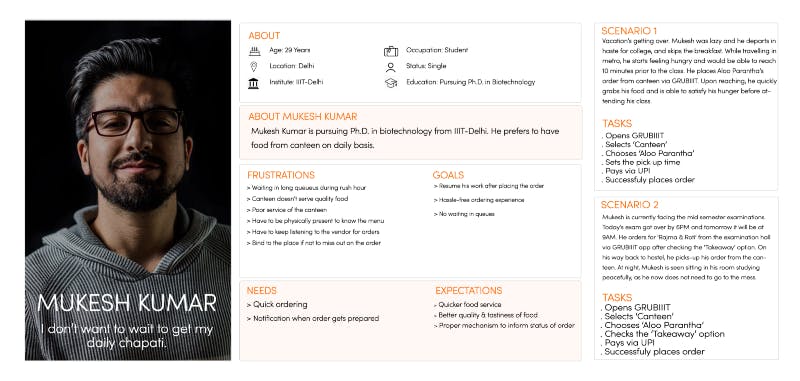
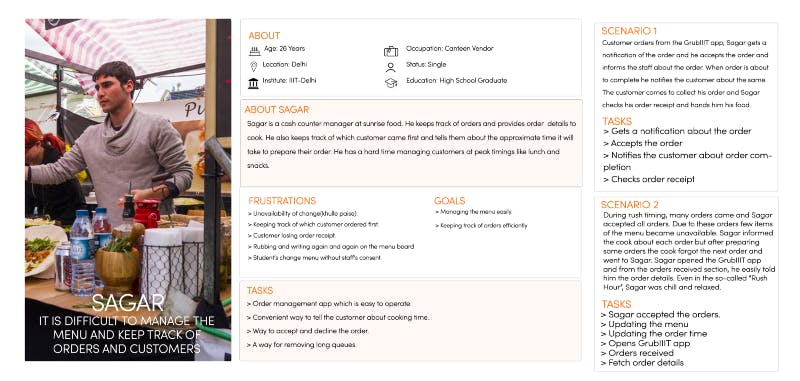
Persona — Scenarios
A scenario refers to the “descriptions of natural, constructed or imagined contexts for user-product interactions.” - (Sabine Madsen and Lene Nielsen, 2010)
Who we chose and why?
We chose three personas, a Ph.D. in biotechnology at IIIT-Delhi, a cash manager at sunrise food corner and a B.Tech student. Apart from their different work life and origins, they possessed different interests, goals, frustrations and the expectations from the food life at IIIT-Delhi. This was a key factor in deciding the selection of the personas, where each had a different insight to offer for the same goal that we wanted to achieve. This proved to be fruitful as we got to know of the issues such as communication being a barrier in placing the order, the need to be physically present at each food corner to know the menu, digital payment being restricted to Paytm, absence of feedback at some food corners.
Storyboards
“Storyboards are illustrations that represent shots that ultimately represent a story. Basically, it’s a sequential art, where images are arrayed together to visualise the story.” — Nick Babich, 2017
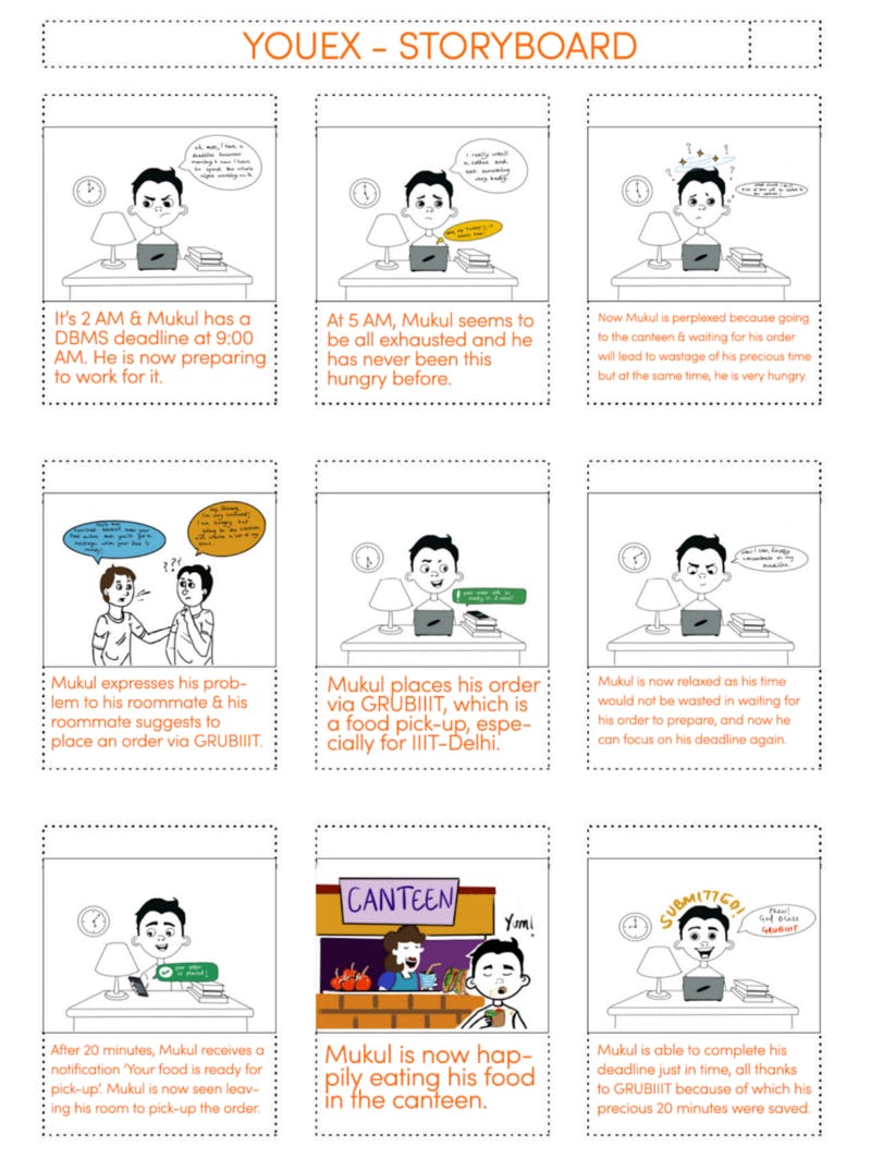
Why did we choose to develop this story?
In our story, the character was a B.Tech student residing in a hostel. The scene is set in his room, with his roommate right there with him. The plot is such that the student has a deadline at a particular time but then he’s perplexed how to get food from the canteen without going to it, so as to work for the deadline meanwhile. His friend suggests him to use GRUBIIIT to place the order for pickup. Twenty minutes after ordering he receives the notification that his order is ready for pickup. This story offers the reader:
- Work-life of the character at IIIT-Delhi.
- The constraints that the character is facing.
- The confusion and hesitation to sacrifice one thing for the other, corresponding to the current situation.
- How easily the awareness of the application will grow within the hostel.
- Notification system integrated into the application.
- Bring out the need for such an application.
My Learnings
While brainstorming for the storyboard, each of us came across many different ideas. While the current scenario covers the problem and presents the need for such an app, I had an input that ‘ what if we show that the other person is picking up the order?’ That’d convey that the application also provides the feature for someone to rely on others while they are busy doing something. From this activity I learnt how a designer can present a case to someone who does not possess any knowledge about an issue, delivering the message effectively using words and visual elements.
Information Architecture
An unplanned way to organize content in the application takes us back to square one, users might feel frustrated and might not give even it a second chance and uninstall the app! This is why it is important to have a planned, diagrammatic workflow of the application. Have a look at our broad architecture that gives an overview of the application:
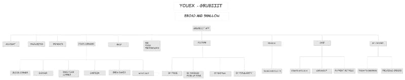
(Overview: Broad and Shallow Information Architecture)
My Learnings
At each and every stage of creating the diagram I felt more conscious of what I am doing, and how things are going to work out. The workflow on completion, showed a definitive manner in which a particular user scenario be handled. Also from the feedback of our professor, we came to know that:
- ‘Filters’ don’t belong to an information architecture,
- Enough focus on USP shall be visible.
Prototyping
A prototype is a draft version of a product that allows you to explore your ideas and show the intention behind a feature or the overall design concept to users before investing time and money into development. A prototype can be anything from paper drawings (low-fidelity) to something that allows click-through of a few pieces of content to a fully functioning site (high-fidelity) — Usability Gov, 2019.
Low-Fidelity Prototype [Individually done by members of YouEx]
Wireframes need not contain fancy UI, they can but it’s not necessary. It should just reflect the skeleton of the UI.
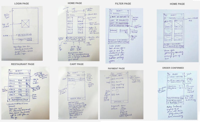
(Certainly I need to level up my drawing skills)
While I made the low fidelity sketches I was quick with drawing out whatever just came to my mind on paper to represent/communicate the rough idea of what I had thought as the most important thing should be available to the user in the thought scenario. The process that I followed in drawing them was by imagining a scenario where a new user wants to use GRUBIIIT and wants to place order after applying filters to the food corners.
Mid-Fidelity Prototype
While doing the medium fidelity prototyping, I thought of it as a little more detailed version of the low fidelity one. It’s like adding a life to a skeleton.
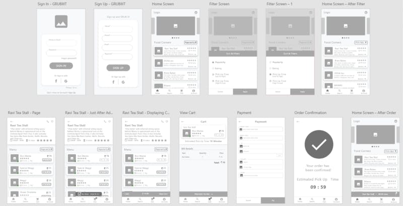
High-Fidelity Prototype
Again, I was honored to have the opportunity to build the wireframes for the group and as soon as I completed it, I surely knew I learnt a lot. While doing high fidelity prototyping, apart from adding color, images and actual text to the placeholder, the major time was spent in iterating on how users would operate on such a prototype. Basically in high fidelity we sort of evaluated on complex-interactions. We iterated over issues in our low and mid-fi and introduced a new features named ‘GRUBfeed’ & ‘Pickup Buddy’ in the final deliverable.
Prototyping Evaluation [Guerrilla Testing]
“Guerrilla testing is a means of gathering user feedback by taking a design or prototype into the public domain and asking passersby for their thoughts. Due to its simplicity, new ideas can be tested quickly and at a low cost, making it a valuable UX testing method.” — Elizabeth Chesters, 2017
Evaluation Process
We selected a scenario which the user would be asked to execute. One sat, observed and wrote down the difficulties users were facing and any additional comments they had.
The Scenario
“So you have to use our app and see what others are posting on social forums. Place the food order from the post directly that you find interesting and request if any user can pick it up for you.” — described general actions, where we intended the user to use ‘GRUBfeed’ in the application to proceed with the given task.
Who did we select to evaluate our prototype and why?
We had student hostellers and day scholars from different years to evaluate our high fidelity prototype. We selected such an audience so as to obtain a wide range of insights and critique according to one’s experience.
Relevant User Quotes
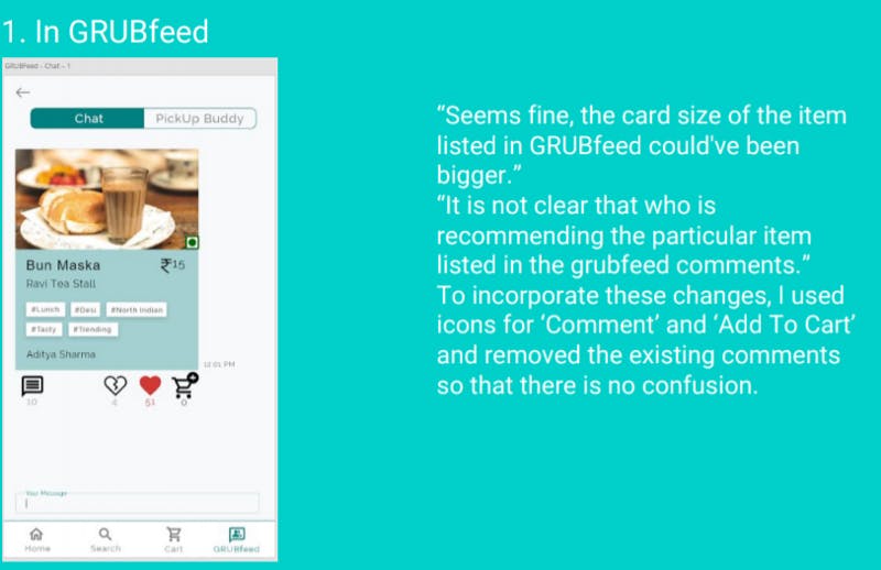
“GRUB feed should be made GRUB chat because it looks more like a chat rather than a feed.”
“Scenario was easy to execute except the pickup buddy button at the order confirmation screen should be made look more like a button and I wasn’t aware of what it was also so some info to tell the users what it is would be helpful.”
“First of all, I think GRUBfeed is pushed to the corner, GRUBfeed should be in the centre. You should change the name, and the cart should be in the corner. Usage of tags on items listed in the GRUBfeed seems helpful in narrowing my search. PickUp Buddy seems a very promising feature.”
My Learnings
Yes do think, but from the users mind only! — Even after going through such an extensive while designing the high fidelity, I can’t believe we missed many things. People were able to point out things that I couldn’t even imagine.
Prototyping Revision
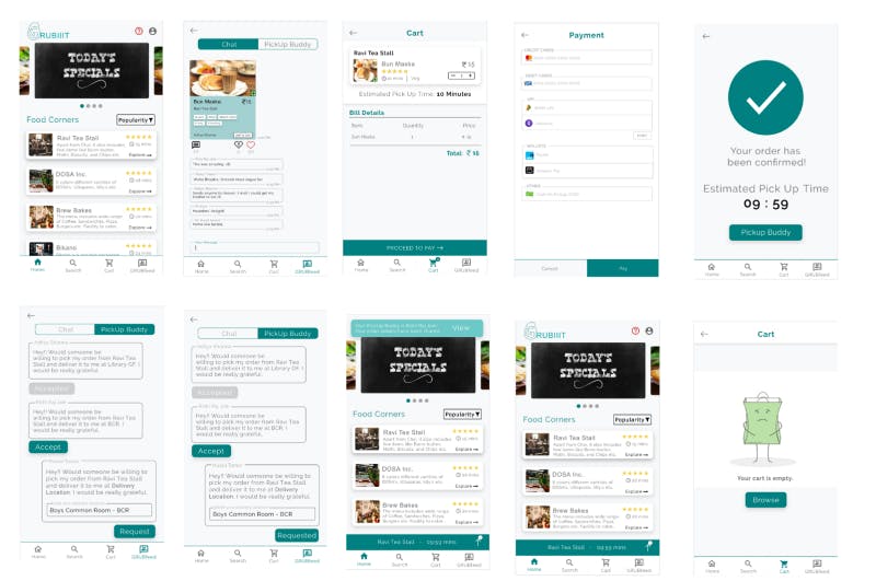
It is the user we are designing for! After documenting the user feedback and preparing the summary of the issues and recommendations by the user, I would think deeper into those points and look for certain practices that might help in incorporating those changes effectively. One of the points that I recall was “GRUBfeed is pushed to the corner, bring it to the middle or center for drawing user’s attention” , will require a thought as the dynamics of the app would then change. This is an important issue, as GRUBfeed might just be the selling point of our app.
(Revision of GRUBfeed Page with the relevant User Quotes)
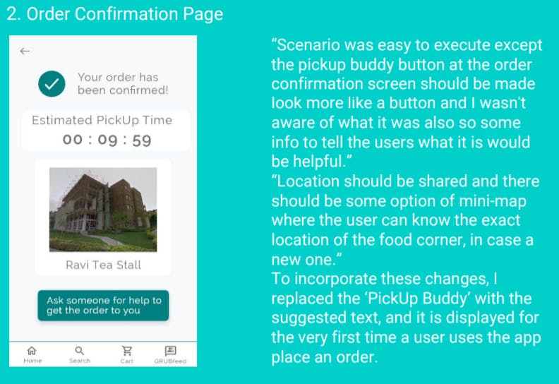
(Revision of Order Confirmation Page with the relevant User Quotes)
Summary
https://miro.medium.com/max/1050/1*hp-yfKsmzsj711iLbM8eEw.jpeg
While working on this, I had interactions lot of interactions with colleagues both formal and informal, read some of the articles as referred by our professor and practiced the complete design process. I wouldn’t have been writing all of this if I had not documented my whole work for the final submission, so that’s how documentation is. Thanks to Dr. Grace Eden, Arpit Bhatia and Anupriya Tuli for their guidance, regular feedback and motivation!
References
- Mills, D. wiki.c2.com(2014) Problem Domain
- Dalryple, B., medium.com (2018) Competitive Analysis — User Research
3. Persona-Scenarios — https://classroom.google.com/u/1/c/NDc3NTM4MzgzOTFa/m/NTI yMDIwNTU1NjJa/details
4. Babich. N., uxplanet.org (2017) Storyboarding in UX Design
5. Studio. B, uxplanet.org (2017) Information Architecture. Basics for Designers.
6. usability.gov (2019) Prototyping